When you look at the energy landscape, you realise there are a lot of spreadsheets around. And although we do our best to automate and remove them, you know what? They are still the best tool around for analysing and drilling into data assuming all the relevant data is contained within them. The truth is, you can’t beat them.
But there are lots of things spreadsheets aren’t good at. For instance, they’re not particularly useful if you wish to easily see your energy intensity (kWh/Square Meter) on a site by site basis, how this is trending over time and then share this information with several hundred sites up and down the country – to get people involved in energy reduction, through leader boards and site competitions. So Excel is great for the static one off analysis, which is shared with a handful of people. But not so marvellous with dynamic data that needs to be shared across hundreds of people.
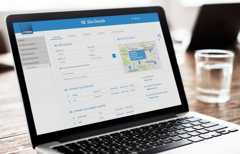
At Utilidex we are addressing the latter problem – sharing meaningful data, across large numbers of users to make a real difference to your energy portfolio. Cloud technology has made it possible to share information with those that matter and using our platform it’s now easier than ever to crunch through data at lightning speed and visualise and understand that data. So you can create important insights that then allow people to make positive change.
So yes, our dashboards will have kWh, £s, energy cost breakdowns. They’ll have cost/square metre, energy intensity per/square metre. We’ll have your PPU (Pence Per Unit) by site, and the cost profile; so you can see the cost of energy throughout the day to check those red zones and how costs are changing.
We’re building for the companies that want an integrated energy strategy. For the companies, that want on-site managers to take control of their energy costs/energy intensity; those who perhaps don’t understand (or need to) the difference between kWh and kVarh. But people who do want to make a positive difference and given the right insight, in the right way, absolutely will!


