
Why kWh won’t help you
Most companies are used to receiving their half-hourly data about sites in kWh. And you need to understand down to the HH level, as many technologies impact at this level.
Below is a simple illustration of this conundrum. The drawing is not an accurate portrayal of the curves, but is used to highlight the key challenges presented.
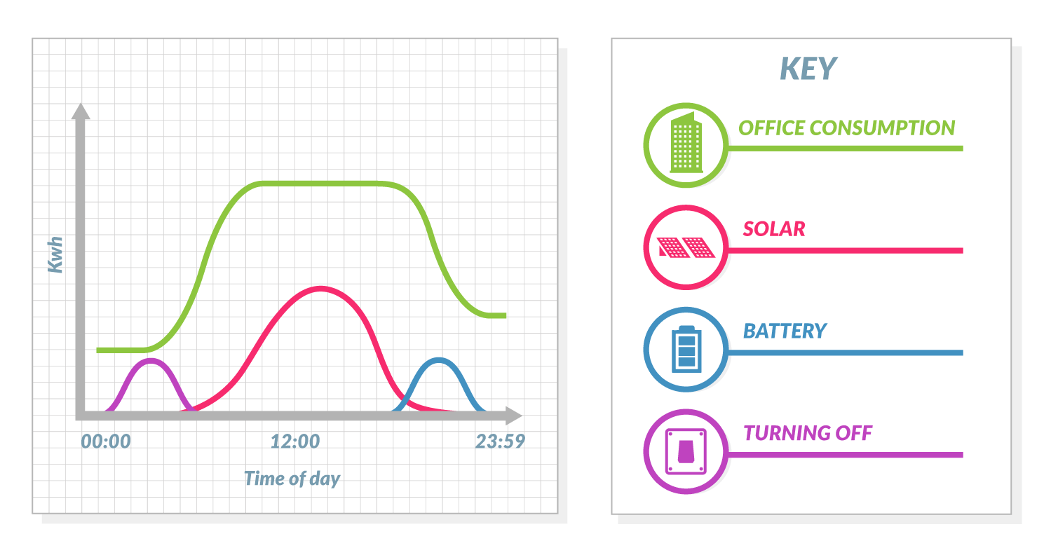
In this example, the solar (red line) peaks during the day, the purple line is how much power could be saved if you shut down, and the blue the power from a battery if you choose to use power at this time.
But where to start?
- Which technologies are right?
- Should you use batteries and solar? And if so, when do you charge up, when do you use?
- What’s the expected cost reduction this month? Next month? Next three years?
- And if this is one of my sites, and I have 100s, what does it look like for the rest of them?
Looking at £s makes it much easier
Now let’s look at this world differently. Let’s take the same chart and overlay the £/MWh
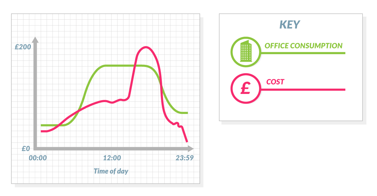
If you have this data for all your sites, both historically and forward looking (for next 3 years), business cases become a lot easier to create and validate.
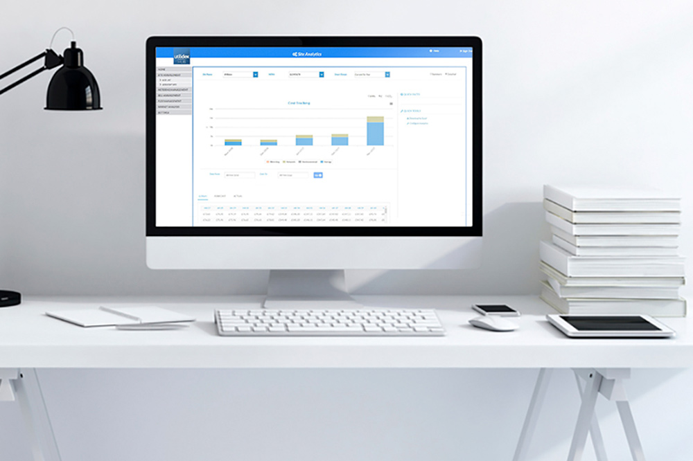
Utilidex | Hub – making business cases easier
Utilidex provides half-hourly costs, making it even easier to assess business cases, and validate technologies. We knew to answer the difficult questions above, you needed to see your data in £s by half-hour, so have created the industries only platform which combines both your energy commodity costs, plus all third party charges and then distils this to a half-hour cost curve for you site by site.
If you would like further information on half hourly costs, please contact Richard Lewin.
